lmao im always in this dilemma where i dont want to say the phrase “dude chill out
its just a cartoon” because that would sound like im underestimating the importance of what animated narratives mean to people or it’d sound like i’d be saying that family content shouldnt be taken seriously
but at the same time, everytime i see ppl getting really mad about cartoons on an unhealthy life-consuming level i just have to say it. “dude chill out its just a cartoon”
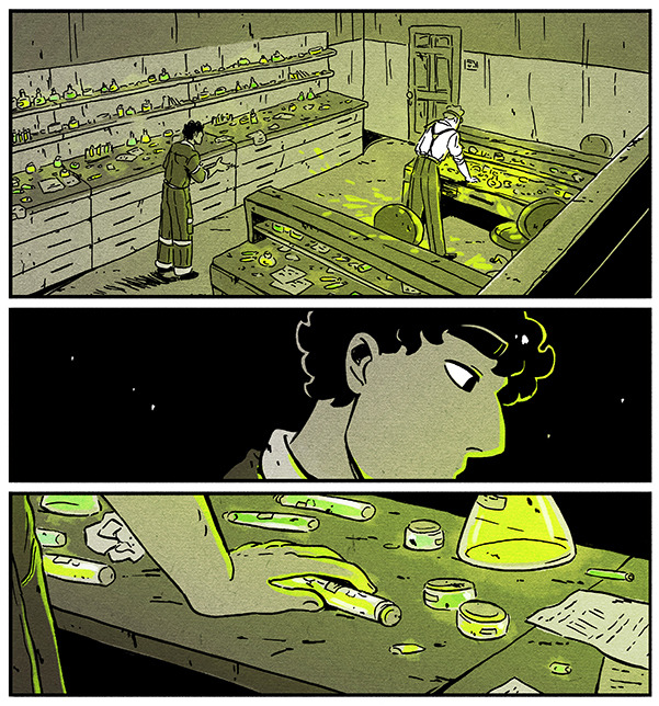
I’m by no means an expert on drawing comic environments, but I’ve been using a few specific methods to get them done which I’d like to share! These tips did pretty well on Twitter so I figured I might share them on Tumblr as well [example panels from my webcomic Shaderunners]:
First, if you’re drawing backgrounds while using straight lines/a ruler and you’re struggling with your environments looking stiff, FREEHAND! It makes everything looks more natural, even if it’s not technically always “accurate”. Here’s a comparison (old/recent):
In general environments look more real the more “imperfect” they are, This isn’t a hard and fast rule of course, and I’m sure there’s cases where a stiff quality is HELPFUL to your story – so I think being aware of the difference in effect is key!
Second, for environments there’s a little trick I like to use, and this kinda depends on your style and how rough the place you’re drawing is, but I like to add little marks and dirt to the walls, the floor, everything. It makes things feel more real/lived in.
Third, get SketchUp or a similar 3D modeling software. Drawing a comic is hard work and if you’re doing it alone some shortcuts will have to be taken – that is NOT to say that it’s cheating if you take them. It’s simply helpful.
A thing I never see talked about is how 3D modeling is a SKILL, not a magic hack. I had to get BETTER at creating environments in SketchUp and incorporating them into the comic organically. Here’s an example of an old background done with the help of SketchUp above a recent one:
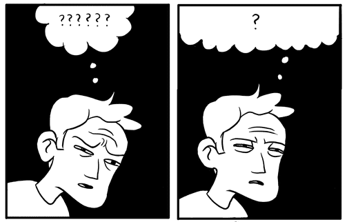
There’s No Need To Colour Everything. See how in the first pic below I coloured (er, you know) every object on the shelves? Waste of time – if anything it takes away focus from the characters. Nowadays when things are small, faraway or unimportant I let them blend into the background.
Similarly, in crowd scenes I used to draw every single person and detail, thinking that it would look impressive. The result was spending hours on a panel readers would look at for two seconds. Plus, after all that work it didn’t actually end up looking like that big a crowd.
Compare that to crowd scenes I draw now – by no means perfect but I feel that leaving out details in the faraway figures makes the scene look fuller; it leaves room for the reader’s mind to fill in the gaps and imagine the crowd being bigger than is shown.
And uhh that’s it? Basically this advice is mostly little tips that can be helpful, rather than a guideline/rule. Environments in comics (to me at least) are an efficiency game, and I’m constantly thinking of ways to be economical when I work on them while also having fun!
Hopefully this was helpful to someone out there, and if you were intrigued by these panels you should check out my webcomic at @shaderunnerscomic!
What is happening here is the water is allowed a steady flow without any change in pressure. It’s like an open top container with a lot of water in it so the hole doesn’t need to compensate pressure by sucking in air, which is what make the usual wiggly water effects you’re used to.
Yep. This is called laminar flow. It has nothing to do with the camera’s frame rate or shutter speed like what some people are claiming in the notes.
Being an artist and into Homestuck is like. It WILL cure you of art block. BUT. The catch is. You can’t fucking draw anything that ISN’T Homestuck. No matter how hard you try. It always ends up being homestuck. Im crying.
When you need to use royalty free music but can’t find any you like so you make your own but then you remember you don’t know how to compose music but you spent all this time making it and you’re not turning back now
i was getting ready for bed and this gave me a heart attack holy shit