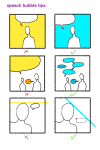
I’ve been getting quite a few asks about the process for the patterns in my stylized artworks, so I decided to put together a couple of tips regarding them.
Firstly, what you need are
— CUSTOM BRUSHES —
Most of the patterns I use are custom brushes I made, such as those:
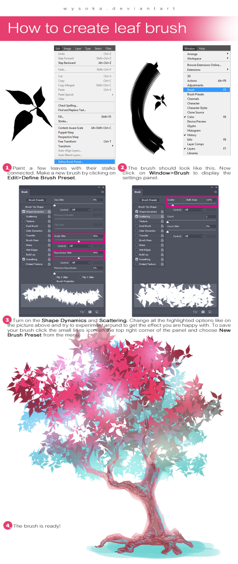
For the longest time I was convinced making brushes must be super extra complicated. I was super extra wrong. All you need to start is a transparent canvas (2500px x 2500px max):
This will be your brush tip. When you’re satisfied how it looks, click Ctrl+A to select the whole canvas and go to ‘define brush preset’ under the edit menu
You will be asked to name your new glorious creation. Choose something that describes it well, so you can easily find it between all the ‘asfsfgdgd’ brushes you’ve created to be only used once
This is it. Look at it, you have just created a photoshop brush. First time i did I felt like I was cheated my whole life. IT’S SO EASY WHY HASN’T ANYONE TOLD ME
Time to edit the Good Boi to be more random, so it can be used as a Cool Fancy Pattern. Go into brush settings and change whatever you’d like. Here’s a list of what I do for patterns:
– under Shape Dynamics, I increase Size Jitter and Angle jitter by 5%-15%
– under Brush Tip Shape, I increase spacing by a shitload. Sometimes it’s like 150%, the point is to get the initial brush tip we painted to be visible.
– If I want it to look random and noisy, I enable the Dual Brush option, which acts like another brush was put on top of the one we’ve created. You can adjust all of the Dual Brush options (Size, Spacing, Scatter, Count) as you wish to get a very nice random brush to smear on your backgrounds
The result is as above. You can follow the same steps to create whatever brush you need: evenly spaced dots that look like you painted them by hand, geometric pattern to fill the background, a line of perfectly drawn XDs and so on.
BUT WAIT, THERE’S MORE
— PATHS —
But what if you want to get lots of circles made of tiny dots? Or you need rows of triangles for your cool background? Photoshop can do all of that for you, thanks to the magic of paths.
Typically, paths window can be found right next to Layers:
Draw whatever path you want, the Shape Tool has quite a bit of options. Remember, paths are completely different from brush strokes and they won’t show up in the navigator. To move a path around, click A to enable path selection tool. You can use Ctrl+T to transform it, and if you move a path while pressing Alt it will be duplicated.
Now, pick a brush you wish really was in place of that path you’ve drawn and go to layers, then choose the layer you want it to be drawn on. Then, click this tiny circle under the Paths window:
Then witness the magic of photoshop doing the drawing for you while you wonder how tf have you managed to forget about this option for the past 2 years
You can combine special brushes and paths for all sorts of cool effects. I mostly use them in backgrounds for my cards, but you can do whatever you want with them.
I hope that answers the questions for all of the people who were sending me inquires about the patterns. If you have any questions regarding this or any other Photoshop matter feel free to message me, I’m always up for complaining about how great and terrible Photoshop is C’:
SHORT STORY/ONE-SHOT/ONE CHAPTER/COMICS 101 CRASH COURSE RAPIDPUNCHES’ STYLE
I’m NOT an expert but I have some working experience I can share. You need experience to become great. Here is my set of instructions, tips, and notes towards making a 12-page comic.
My method is to work backwards. Personally I work “backwards” because the end is the only wholly necessary page or set of panels in the story. Everything in between is open to editing and hacking as the most important moments are emphasized and chosen.
I even plan/draw the end page first. The end is the last page a reader sees- so spend your freshest energies on making it as epic, memorable, poignant, and beautiful as #$%^&.
If you draw the pages from 1 to 12 sequentially you run the risk of fresh to burnt out- an uneven distribution of drawing skill. (treat the first page and the 2-page splash as you would the last).
Roughly… the steps to making your comic is
WRITE
PLAN THUMBNAILS
DRAW
…BEGIN THE WRITING (DO NOT SKIP NO MATTER WHAT) like this, in this order:
How does it end?
Does the protag succeed or fail?
What is the turning point of their story?
What the protag do that led them there?
Where does it start?
Who is this protag?
EXAMPLE:
Guy gets mauled by a bear.
This is a fail on the guy’s half.
The bear must eat something or he’ll starve to death.
It’s the guy’s fault the bear can’t find other food. He caused the avalanche that buried all the cabins.
The guy is yodeling in an avalanche zone.
The guy is some guy.
CREATING “THE BEAT SHEET” Take the above stuff and reorder it to make sense.
This guy yodels.
Echoes roll.
Snow slides down.
Avalanche buries the mountain.
Cabins are engulfed.
This bear has no access to cabin food and garbage.
Bear eats this guy.
Expand. Blow up important beats for emphasis. Keep less important beats brief.
This guy is hiking in the snowy mountains.
He comes across an avalanche warning sign.
There is nobody around but him.
A dumb expression forms over his face and he yodels.
Echoes roll but nothing nearby is moved.
At the top of the mountain the snow drifts twitch.
Guy, satisfied, hikes away from there still yodeling.
Frozen snow cracks.
Snow puffs billow and great slabs of ice crash down the mountain side.
Guy sees this and hightails it to safer ground.
Animals, people, are all panicking and getting pushed over by the rushing snow.
Cabins are destroyed.
The guy takes cover by an outcropping of rocks, fastens himself securely to the rock face, and waits for the avalanche to die down.
Avalanche dies down.
A lone bear shambles over from the other side of the mountain.
The bear goes to where a cabin used to be (only roof tiles are left). Bear sniffs a dish satellite.
Bear forlornly eats a food wrapper.
Bear tries to dig.
Guy comes down from the rocks he as climbing and sees bear.
Bear stops digging and sees him.
Guy runs.
Bear chases him down.
Bear eats the guy.
BEAT SHEET COMPLETED!!!
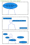
After the beat sheet, write up all the sound effects and speech bubbles and conversation/dialogue you want to be in your comic.
Since comics are a visual medium, highest priority is given to the beats. If a story can’t be told with the art without the dialogue– you messed up and it’s time to rethink your life choices.
Try to keep all your text chunks as short as a tweet. Professionally you don’t want more than 25 words per speech bubble and no more than 250 words per page.
Next is translating the beats to pages…
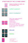
STRUCTURE OVERVIEW:
[1] point of entry, in media res, hero intro
[2][3] conflict. establish conflict, setting, and mood by the third page. [4][5] rising action/false resolution to conflict/investigation
[6][7] turning point/plot twist/epiphany (this one epic image, to page spread is pivotal, spend a lot of effort into creating this)
[8][9] aftermath/“darkness before dawn”/struggle [10][11] recovery/“rise and conquer”/“fall”
[12] resolution/final end/cliffhanger
[front cover][interior] [interior][back cover]
——————–
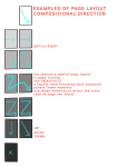
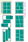
My maximum per page is nine panels but I’ve seen pages that have way more. I like to have about 3 to 4 panels per row or less but I’ve seen the “rules” broken before. Advanced comic book artists manipulate time with the number of panels and the size of each panel.
remember, DIAGONALS!!! open up an issue of batman, superman, spider man, deadpool or whatever youre reading theyre everywhere.
———-
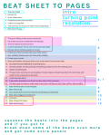
…DRAW IN THIS ORDER:
Page 12,
Page 6 and 7 (this is typically one large image that takes up the space of two pages),
Page 1,
and then the rest.
ONLY “DEVIATION” ALLOWED:
Page 12 and 1*
Page 6 and 7,
and then the rest.
*Draw the first and last page as a spread in situations where the beginning of the story mirrors the end of the story.
Cover is dead last.
———-
(If at the very end you find out you need more pages and it’s absolutely unavoidable and totally necessary you have to add them in fours. Try to stick to 12 pages for this crash course.)
——————–
FURTHER NOTES:
Plan and draw the pages in spreads (the twos) since this is how it will appear in print and when you submit them to an editor for review guess what, the pages with an exception to the first and last will be reviewed as spreads.
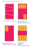
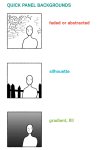
You at most only need one establishing panel of the setting and environment (scene) per page.
Forget “true to life” perspective outside of the establishing panel). Practice diagonal composition of objects and subjects within panels. For dynamism.
You don’t have to present the text all in one go (one paragraph or bubble). You can and should break up paragraphs, sentences, and if you need to single out words– to make smaller, more easily managed bubbles to scatter through the panel.
Less important moments have smaller panels and or lesser detail. More details (or more word bubbles) slow down time. More drawn detail also creates a concentration of values (it’s darker and sometimes combines together as one shape or mass)
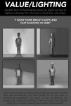
Know your light sources. Control the blacks. Control the values.
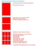
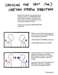
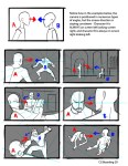
Hey kids! If you’re a filmmaker, animator, or storyboard artist and you don’t know what screen direction is, you might want to read this.
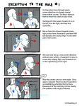
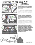
For the record, there are always exceptions to the rule in filmmaking, which is why I pointed out 3 examples here.
I’ve also found that comic books tend to NOT take screen direction as seriously as film does, but I’m still on the fence if this is wise or not. My favorite comics pay close attention to screen direction so as to not confuse the reader.
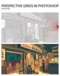
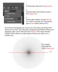
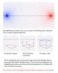
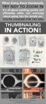
If you’ve ever tried to draw a perspective grid by hand, you know that it totally sucks butts. Here’s a quick and easy way that I use that lets me establish the basic perspective of my drawing in less than 30 seconds. This is the first 3 pages of the tutorial, and the rest of it is available on my Patreon!
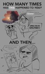
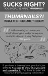
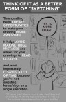
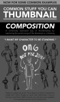
It’s here! For those artists who spend loads of time trying to figure out why their art is not coming out the way they want it to be, making thumbnails (or making studies) is the thing for you! It’s also great of getting rid of the habit of zooming in.
Well, I’m still learning myself, but here’s a few tips I usually keep in mind!
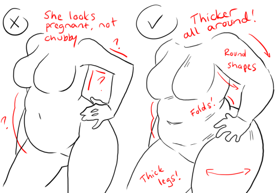
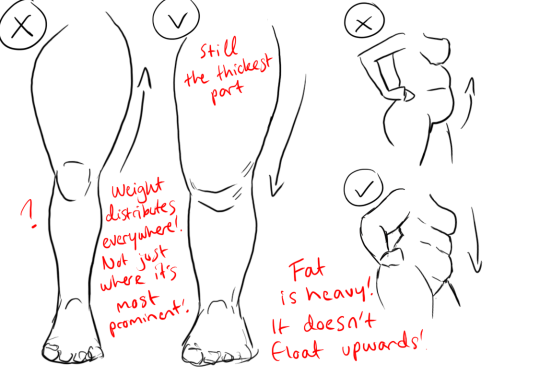
1.) “Fat” is not just a big belly!
Fat distributes everywhere, but not necessarily equally! Like at
any weight, every body is different and has an unique shape! Some keep a
hourglass shape, some become more pear-like, some are shaped like
teardrops or apples… but the basic thing is, fat doesn’t just choose
one place where it WON’T gather. It may not be as visible in some area
compared to another, but in real life, it’s reeeeaaaaalllllyyyy rare to
just find a person whose fat only stores in their bum, thighs and tits,
leaving their waist, arms, neck and etc slim. Keep the body pleasant and
thick all around, not just in the places where the weight-gain is the
most imminent!
Keep the round shapes in mind!
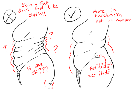
2.) Rolls! Folds! What are they?
What are they? Not something to be afraid of, that’s for sure!
Basically,
don’t hesitate to give your characters fat rolls. Skin folds, stretches
and moves along with the body, and so does the fat under it! However, a
lot of people who draw rolls tend to give the character many super
small ones — this is not how rolls work! Usually, the thicker the
person, the thicker the rolls — they increase in size, not necessarily
in number.
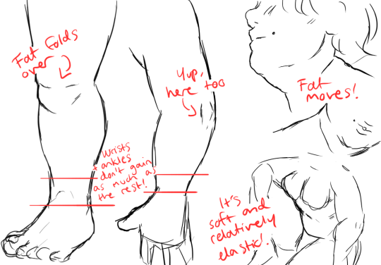
Rolls are the most preminent in places where the body moves the most, AKA the joints. Fat folds over itself and creates creases and ‘rolls’.
3.) HOWEVER….
(No references here, sorry!!!)
When we age, our skin loses its elasticity and it can’t keep the rolls and folds thick and perky. In our youth, our weight can be held up way better than in our elderly days due to the stength and adaptivity of our skin which disappears as we age. Thus, fat tends to droop lower with older people, and the rolls appear thinner. This can also happen if someone who has had a LOT of weight packed up suddenly losing a big chunk of it — the skin can’t adapt and will begin to “droop“ down and lower. Make sure to keep such factors in mind when drawing and planning how the weight of your characters should be carried!
And then, a lil tip that;
4.) Study references and real life!
If you yourself pack some weight or have access to internet, libraries or just life on the street, you will see how bodies at different weights and shapes work and move. Use references, see for yourself — try to find how fat distributes and especially, HOW IT FOLDS! Folds and rolls seem to be one of the biggest problems many have while drawing thicker characters, and that’s ok — we’re taught as a society that fatrolls are inherently bad and disgusting, therefore there are not many situations where we’d find ourselves just… staring and studying how the fat in our bodies works and moves. You’ll learn quickly, though!
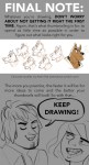
I’m still learning myself, but especially since every body is different and the weight we pack acts in unique ways, it can be really challenging to find the ‘absolute’ right way to draw thicker characters. Don’t give up! You’ll get the hang of it eventually!!
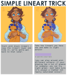
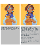
The easiest way is to lock the lineart layer (so, yes, that means that it should be separate) and use a soft brush (any kind will do) to colour delicately over the lines.