Spent the last two days working on this little archery guide in art and writing. Considering the rise in popularity of archers in pop culture this hopefully comes in handy for a bunch of fandoms.
I frequently see artists complain that their finished works got less attention than mere sketches, doodles and other smaller or less serious work. Which is frustrating! But almost as often, I can see exactly why the doodle got more attention. I’m going to cover some of these reasons, so you can use that information so you can do more than fume about it.
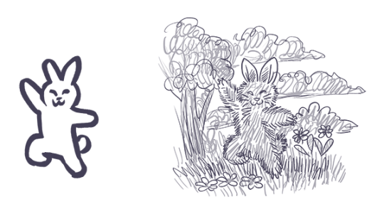
The doodle is easy to read, the polished work is busy
The polished work is completely drenched in little details that the artist slaved over, but the details create a kind of overall noise that makes everything harder to understand, making the whole image less appealing.
Don’t get too lost in little details, work from larger shapes to small details, use things like a highly readable silhouette, contrast, variance in line width or negative space to keep the image understandable. Pay attention to the composition to guide the eye where you want it.
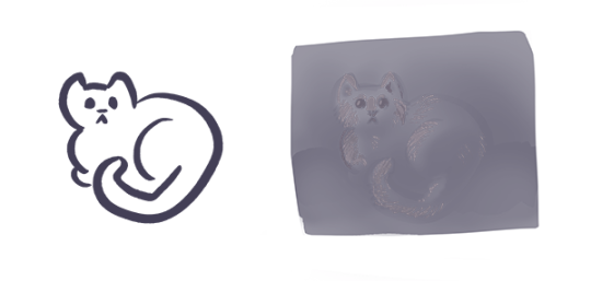
The doodle is high contrast, the polished work is low contrast
When you do lots of details all equally well lit and easy to see, overall you lose the strong lights and darks that make a work pop. You have to sacrifice some of those details, let them be in shadow or out of focus in the background, to create a more appealing image overall.
You might also be forgetting that without lineart you need to use strong lights and darks, since lineart creates it’s own natural high contrast.
Contrast draws the eye, use that to create focus where you want it.
The doodle is simple to understand, the polished work is highly ambiguous in meaning and message
Many doodles that outstrip the artist’s polished work are jokes. Jokes usually have a specific clear focus and message, the viewer can understand it immediately (if they couldn’t, it wouldn’t be funny). You don’t have to make everything funny, but like a joke, you need to get to the point and give the audience the information they need to “get it.” More details can be present, but the viewer should not be confused about what to look at from the outset. Remember: people will look at and interpret your art in milliseconds. They might give it a longer look but only AFTER that millisecond look.
The initial glance is like the first page of a book. If it wows them they keep looking to understand more, if they are lost and confused, no second chances, they’ve already scrolled away.
You can use things like composition, basic structures of shapes and simple shape symbolism to give viewers the initial information they need to stay interested. Don’t feel like you have to abandon more personal and difficult to parse symbolism, these things can work together to create intrigue.
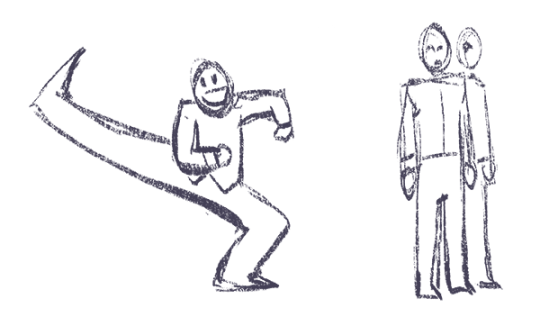
The doodle is fluid and expressive, the polished work is stiff and dead
The sketch for your polished work needs to be done with spontaneity and fluidity. When you want to really flex your drawing skills and show the world your beautiful realistic human faces, your sublime anatomy, gorgeous textures – it’s easy to forget about the undersketch and jump to rendering as soon as you can, creating a stiff or boring sketch that isn’t worthy of all the time you’re sinking into the minute details.
Practice quick gestures, read up on line of action, and before you make a polished painting, make sure you have a sketch that’s fun to look at even without the detailed rendering. Thumbnailing helps. Studies too. Sometimes you have to do the bad boring sketch, but you can take a few stabs at it.
You can’t make a bad sketch good by painting more details on it, you need to work out the sketch first before moving to the details.
Remember, if you’re going to spend 20 hours painting the thing, you can afford another half hour sketching a few different takes on your idea before digging in.
Lots of doodles, very few polished works
If you mostly post one kind of thing, your audience will be people who like that. Also, you may not have much practice with the techniques you are using in the polished work, while you have become a pro at doodles. You become an expert at what you practice, do more of what you want to be known for, become an expert at it, make it the only thing your audience is there for.
The audience is familiar with the subject of the doodle, unfamiliar with the subject of the polished work
Many artists do doodles of fanart and get fed up that people like that more, but the truth is, they don’t like it “more” they just already know they like it. You can increase the chances of people appreciating your original works by making sure they can understand what’s going on in the illustration without prior knowledge of who these characters are, or simply sticking to it until you have garnered an audience. Just keep at it.
Remember, the creators of the property you made fanart of are themselves artists who were pushing an original idea at one time. You can follow in their footsteps.
The doodle is quirky and unusual, the polished work is stale and samey
This can happen when an artist has an image in their head of what a SERIOUS and PROFESSIONAL painting looks like, usually based on a very narrow subset of artwork, often itself based on the same cargo cult of seriousness.
Try studying works outside your usual stomping grounds. Look to artists that likely inspired your faves (if you’re talking about realistic artists who inspired your favorite concept artists, here’s some likely culprits to get you started on the google search: JC Leyendecker, Alphonse Mucha, Norman Rockwell, James Gurney, Rembrandt), look to artists outside your genre, and look at your doodles and ask yourself what “not serious, just for fun” source of inspiration is making them so fresh and vibrant that your audience is connecting to them so strongly. Study that, respect that fun and try to pull it into your serious work.
The polished work was hard to make and no one cares
Being an artist is hard, and that we keep at it is commendable, but struggling and taking more hours doesn’t make a piece better necessarily.
There are a few things to consider here. First, you need to realize looking to the vague faceless masses of the internet for a fatherly “I’m proud of you, son” moment is always going to be disappointing and painful and attempting to guilt strangers into fulfilling that role for you is awkward and inappropriate. You need artist friends who can recognize your hard work and cheer you on and you need to be your own cheerleader, value your own hard work and practice.
Second, you need to realize torturing yourself doesn’t in and of itself make art better. Hard work is something people love about art, the meaning of someone spending that time, but if I screamed for 8 hours, drew a single line, then posted that, the internet wouldn’t be wrong to be unexcited about it. Rather than blame the viewer, think about two things: how can you make the art itself more appealing while still doing the painting that you’re interested in doing, and how can you do that faster and with less pointless suffering?
It’s okay to be a masochist when it comes to art, many artists are, just make sure you’re spending your time and suffering wisely.
You’re complaining about someone else’s “doodle”
Sketches and cartoons are deceptively hard to make appealing, rather than fume that they are getting more attention, look to them for lessons. What could you learn from them? Could you do it? Maybe you should try. Would make a good exercise.
And never get mad that their drawings are more appealing to the internet than yours, even though they spent less time on their drawing than you did on yours. See above for why time is not important here, but also keep in mind they may have been practicing longer than you or may be more established than you.
Keep working on your art, keep posting, push to be seen, advertise your work, put yourself out there. These things take time but work.
Have you ever felt like your art is on the same level for a long time? Have you ever felt like you can’t grow your skills. Have you ever felt like everyone around you grows in rapid speed and you are just like a snail at the end of the race?
I was thinking about that and trying to pinpoint the reasons why you might feel that way. I figured out some solutions that helped me and some other artists I know.
1. Not looking for critique/feedback
‘You can’t yourself pinpoint things you need to focus on because your eye still isn’t trained enough to pinpoint exact problems.’
This is number one problem I see and many professional artists will tell you about that. You can’t be too shy to show your work to people who can give you good critique. Look for professionals who are willing to help you and use that. Critiquing is mistaken to be something hurtful for young artists BUT in reality people giving feedback are trying to help you grow. I know how hard it is to hear that you are still not good enough, that your art is lacking something. Maybe you know that yourself but you can’t yourself pinpoint things you need to focus on because your eye still isn’t trained enough to pinpoint exact problems. The best person to go to would be professional with trained eyes who is able to say by flipping through your portfolio what it lacks and what you can do to make it look better. Don’t be afraid and seek that help. Don’t be too attached to your own art and accept that it isn’t perfect and you need a fresh pair of eyes to look at it.
2. Not implementing the feedback
‘Implementing is the key step in the process of growing.’
After you have done first step from my list and you finally found a professional willing to give you feedback try to implement feedback. Don’t just listen to it, nod few times pretending you understand what it being said. Don’t defend your art and don’t give excuses if the critique is genuine. Implementing is the key step in the process of growing. There is no use in feedback without you actually trying out the tips you were given. The whole point of that is to change your work. You are not being better artists by collecting thoughts about your art. Now it is time to do the work. It actually requires to put time and effort . Usually what people do,after receiving feedback, is they pat themselves on back like it was ‘job well done’ and being lazy. They are not willing to actually put in the work to implement feedback. It is time consuming and you need to put a lot of effort. Although without that there is not any point in seeking feedback.
3. Not trying/not failing enough
‘Embrace failures as a valuable lessons.’
Yes! There is lesson in failure! As hard as it is to understand. Once you collect experience you grow from it and become wiser. You know what path to choose to avoid next time failure. Successful people are the ones that can try something many times before they finally succeed. When they finally succeed it’s just a result of many attempts they have made before. No one is born ready for challenge. People are scared to lose because for our psyche it hurts more than a win feels good. People will try avoid at any cost losing so at some point they give up and stop trying. You can’t say for sure you will be successful artist after you did it for a year and don’t see result. You are not the one deciding how long it takes. It will be done some day. some day you will meet your artistic goals. But you will only meet them by trying and failing probably hundred times on a way. Just don’t be afraid. Those mistakes on a way are path that differentiate you and a professional. They already failed many times to get to where they are now. When you understand that you will embrace failures as a valuable lessons.
4. Doing things that are not challenging you.
‘Feel uncomfortable and pick up this damn pencil and draw like no one else is watching!’
Don’t settle in your comfort zone. You’ve heard that already many times right? That is why. You limit your skillset. Good things come out of comfort zone. If you feel like you have problems drawing something you are probably right. The reason is you don’t challenge yourself enough to draw things that are difficult for you. For example if you are only drawing a boy in front view standing with hands straight it doesn’t sound like the most exciting art right? But what if it’s the only thing you can draw and it looks somewhat decent? Well then, solution for that is easy – experiment with different angles, experiment with expressions, with composition, with different species. Be brave here and discover topics you don’t draw. You art will become more interesting and you will be more confident drawing. Personally I know that this is the hardest part for artists. It is hard to let go of what we know and discover unknown. We feel vulnerable and like we can’t really draw. This feeling sucks. As much as this feeling sucks you know what else sucks? Sucks that your skills are stagnating. Feel uncomfortable and pick up this damn pencil and draw like no one else is watching! I guarantee that after some time you will be surprised with what you created and how your art have changed.
Good luck to everyone who is on path of improvement!
I don’t need to add too much explanation today. A cape, cloak or long coat simplifies the silhouette of most character, gives them a unique look or presence and conceals a lot of the overall anatomy. Keep track of the character underneath to know where to fold, drop or stretch the fabric. The fabric itself should play a role too. Different behave differently. Movement and gravity are key to “ground” your character in the environment and make it look believable.
-Norm @grizandnorm #capeitsimple #100tuesdaytipsbook #100tuesdaytips #arttutorial #arttips
hey, thanks so much! this might get a lil long (as it always does!!) so bear with me.
firstly i want to say, there’s no right or wrong way to pick colors. every artist has their own palette they prefer and i think it’s super delightful to spend time developing your own special sense of color. so even though i’m explaining things in a “this is how you do it” sort of way, it’s not the only way! just my way. the best method to develop your own sense of color is to look at a LOT of art, look at a LOT of the world around you, and practice practice pratice.
at this point in my life i pick colors intuitively just because i think it’s something i’m naturally tuned into, and i’ve been doing it for a few years, so i don’t actively plan my palettes. but here are some things that i think about as i pick colors.
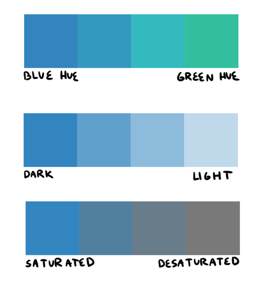
firstly, i want to go over hue, value, and saturation. i’m sure everyone knows these intuitively but i want to explain them in words. hue, value and saturation are what make up a color, and decide how colors differ from each other.
hue: what color the color actually is. red, purple, green, yellow, and everything in between.
value: how light or dark a color is. if you’re painting traditionally, adding more white or more black to a color lowers or raises its value.
saturation: how “pure” the color is vs how much neutral tone is in it.
here’s an example of all three:
this comes into play because a big mistake i see beginners make is that they pick a “just” color, and by that i mean they pick “just blue” or “just yellow”. imagine buying a set of oil paints and only using paints straight from the tube without ever mixing. it would be impossible! so i try to avoid picking “just” colors, except as for a complementary color (more on that in a bit). here are some variations of a red, for example.
so, the biggest thing for me when i pick colors is that i want them all to be friends. i want them all to have something in common so that they get along. i usually lose control of a painting when my colors feel to different from one another. so, i will usually start a painting with one color i know for sure i want, and “subordinate” other colors to it, meaning every other color i pick has to look good with that color. as to how you figure out what looks good and what doesn’t, that just takes time and lots of observation to build a personal opinion 🙂 here’s an example from one of my paintings. in this case, the main color is the trees.
and here’s another from rick & morty, the main color is the sky this time.
now that that’s out of the way, i’m going to give you the Actual Cheat Sheet for color palettes. in color theory, there are 8 basic color schemes that are generally pleasing to look at. here they are.
i usually use an analogous palette or monochrome palette out of preference. the two examples above more or less fall into those categories. however, i also like to use split complementary because the complimentary color adds a LOT of contrast and visual interest. it’s great to use if you have a specific thing in a painting you want to draw attention to. here’s an example:
it doesn’t always have to be a perfect split complementary, just one color that differs from the “family” of colors that take up a majority of the piece.
now! you might be wondering when’s the right time to subordinate a color, or where to put it, or how much of it to use, etc. and the answer is: CONTRAST. there is always visual interest in things that are different. i was rifling through my school notes and found these great types of contrast when working with color.
value: things that are light vs things that are dark.
hue: two colors that look different. I.E. yellow vs blue.
saturation: things that are saturated vs things that are desaturated.
proportion: note the example above. a majority of the painting is orange, so the green stands out because there is proportionally less of it.
temperature: things that are warm vs things that are cool.
complementary: red vs green, blue vs orange, yellow vs purple. when in doubt, these colors always contrast against each other because they have nothing in common (there is no red in green, etc).
simultaneous: this is a little advanced and i’m bad at explaining it, so please read up on it here.
a super helpful exercise is to look at your favorite illustrations, paintings, photographs, designs, etc and assess which one of the 8 color schemes (linked above) it has, and which types (can be more than one) of contrast it has. we did this in school and it REALLY helped me look at color better. here’s part of the assignment i did, the artist is annette marnat.
so! that’s pretty much how i think about color and how i pick my colors! i hope it was somewhat helpful! there’s so so so so much about color theory i can’t even begin to cover, i highly urge you to watch some videos and read some books and articles to further your study. a great starting place would be this series of videos. these are made by my teacher Richard Keyes, i think he had a dvd or something. everything i’ve talked about so far i learned from him and he is an absolute expert in color. these videos are invaluable. if you take anything away from this post, let it be to watch these videos hahaha.
to answer your question about my color leads, every painting was a collaborative effort between the three of us, and sometimes other painters too. it was a very hands-on crew, so i can’t say any of the r&m bgs i did are 100% “mine”. however, i think my personal color sense is waaaay different than jason or phil’s, which made the process very interesting because we usually had 3 very different opinions hahaa. you can check out their work here and here to see what things they brought to the table in relation to my own contributions.
thank you for the ask! again, i hope this was helpful 🙂
Attention non-artists who commission artists: don’t fuckin do this???
Actually had someone do this to me too. Was doing a art stream, it took me over 2 hours to do his inked commission, he got a refund cause ‘it took too long’ that he figured I wasn’t going to do it after I gave him the file.
Don’t do this. Do not.
I’ve had this happen to me with a $350 comic I had already finished it, it was full color, 6 panels and had a full bg in every panel. I was lucky in that I didn’t spend him money yet, but it left me without funds. I’ve also had the above happen to me as well.
Don’t do this shit to artists. We’re people too. Drawing for you is more than a hobby. It’s a job.
Use Paypal Invoices.
I cannot stress this enough. That shit helps A LOT when it comes down to Paypal refunds/disputes.
There’s a description box that let’s you put in what the product is/how long it’ll take/yadda yadda, and then there’s another little memo box that only you and paypal can see where you can say it’s a digital commission and doesn’t require shipping (So Donald Mcfuck can’t say that they never got their commission).
And there’s also a box for your Terms & Conditions where you can say, if you have any conflicts/want a refund – email me, or you can actually tell the user that this is a digital commission and they won’t be getting a hard copy of it.
ARTISTS. PLEASE USE PAYPAL INVOICES. it will SAVE you. And to: the people who do this to artists – Fuck you. It’s okay if you change your mind and want a refund. But freaking TALK to us and let us know what’s going on. Let us WORK with you.
ALSO A HUGE TIP: Invoices paid will automatically set up a shipping notice which, if not fulfilled, can land you in SERIOUS hot water with PayPal. Since a lot of artists don’t print and ship the commissions, this is a huge problem.
However! Totally manageable. Just go to your PayPal, scroll down to find Seller Preferences
>> Shipping Preferences
>> Display Ship Button. Make sure all the boxes are unchecked. Then you’re all set!
As a big supporter of artists, don’t you ever fucking dare fuck over an artist like that. Like don’t. And if they take their time to do a good job, don’t shit all over them for it! Don’t be a fucking ass hole. Just don’t. These people put a LOT of work and time and effort into their artwork. Just don’t be that guy. Often times these artists aren’t even getting what they deserve in compensation.


I had already finished it, it was full color, 6 panels and had a full bg in every panel. I was lucky in that I didn’t spend him money yet, but it left me without funds. I’ve also had the above happen to me as well.


